The Swastika- Between Overt Objection and Covert Support
In 2005 Prince Harry of Wales was photographed at a costume party, wearing a Nazi uniform with the swastika band on his arm. The shock and rage were immense. The unruly prince was rebuked and he of course apologized, admitting it was a "poor choice". There is no point in dwelling on the Swastika, in Eastern religions, (particularly Hinduism, where it stands for the image of Surya, goddess of the sun, and a symbol of luck, abundance and success), not about the adoption of the ancient Asian sign by the Nazis, nor in its recurrence in Israeli archeology in the mosaics of the floors in ancient synagogues discovered in Ein Gedi, Qatsrin and Gamla. Since the defeat of Germany this week seventy-seven years ago, the use of the swastika as well as other Nazi symbols was forbidden as part of its "denazification". Precisely because of this, it is interesting to examine its present day use by those who are aware of its Nazi references per se, as opposed to those who make use of the symbol from a loyalty to its original doctrine.
We can distinguish two different manner of use of the swastika: those who use it explicitly in order to object to what it stands for, and those who use it in a covert way, in order to portray a message that has obvious connections to the ideas presented by the National Socialist party. In any case, the British Prince's explanation of his use of the symbol, as a "poor choice" does not fit either of the above uses.
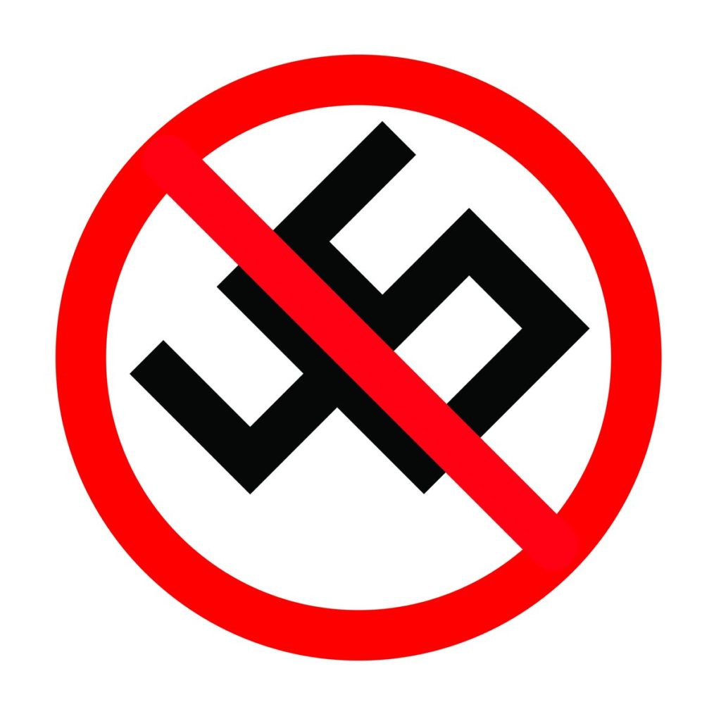
An example of the first usage, is a poster from 2006 that calls for the avoidance of racism at football games. The swastika, identified with the Nazi party, became a general sign for racism of all sorts when designed by the CLM/BBDO advertising agency in Paris. Even after the corners of the swastika were cut the viewer has no need of them in order to identify its geometric form
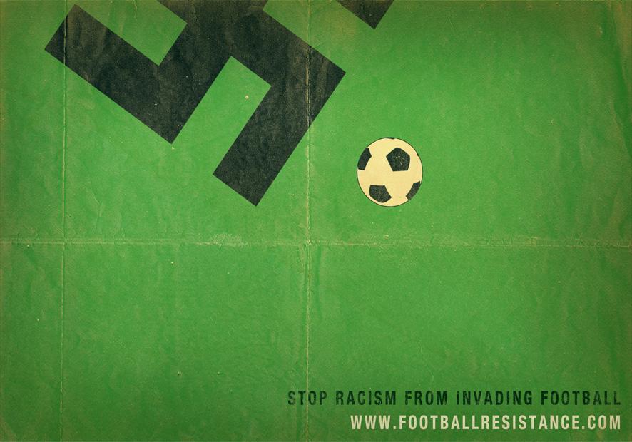
Stop Racism from controlling football
In February 2017 the American artist, Mike Mitchell designed a poster calling for resistance to Donald Trump, who had just become president. He took the number 45 (indicating that Trump was the 45th president of the USA) and revolved it 45 degrees. The two numbers, sitting side by side, encircled in red and cut diagonally by a red line, denote a sign of warning and prohibition. The use of the colors, red, white and black strengthens the similarity to the Nazi flag. The poster, which at first drew no special attention, became viral following the "Unite the Right" rally that took place in Charlottesville (Virginia) in August of that year. Trump did not condemn (certainly not immediately and unequivocally) the "white supremacy" organizations responsible for this rally. Thereafter, the poster was adopted by all kinds of protestors and decorated consumer products including mugs, notebooks and shirts.
Anti-Trump poster, Mike Mitchell, 2017
In 2015, Noma Bar, designed the cover page of the literary magazine of the British Guardian. In his design he adopted the principle of Gestalt figure-background and created a drawing that from one direction you see a white swastika and from another direction you see four red fountain pens. In the center of the composition is written, "Why we are obsessive about the Nazis", with the name Richard Evans (who also wrote the book "The Third Reich in History and Memory"). The black letters together with the white and red are an explicit reference to the National Socialist Party's flag.
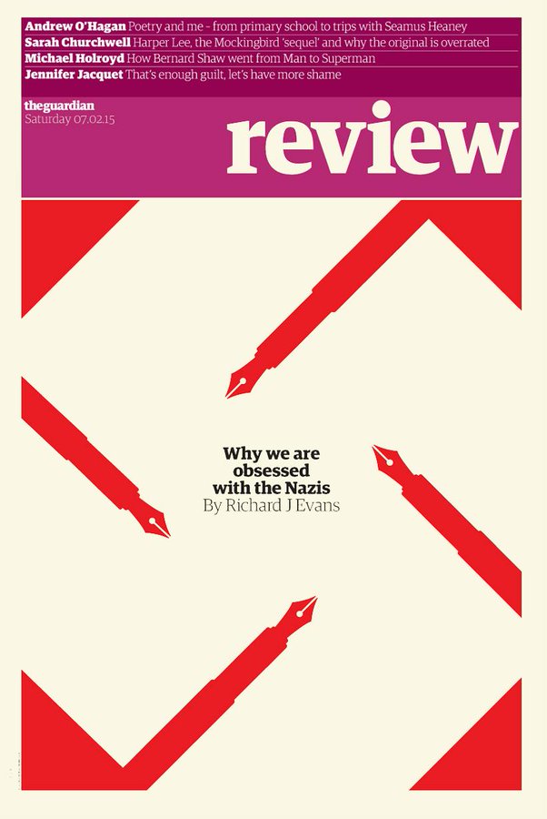
Cover of the literary magazine of the Guardian, Noma Bar, 2015
Bar's implicit use of the swastika, although quite deliberate and obvious, is interesting when compared to those who make use of the swastika, but who deny the reference! For years quite a few extreme right wing parties in Europe and in North America insisted on creating a logo that refers to the swastika, but time after time their spokesmen denied that this was their intention. Although they hate foreigners, preach white supremacy, support neo-Nazi's fascist views etc., they nonetheless claim to have nothing in common with the Nazis. An example is the logo of the extreme right wing Italian party, Fronte Nazionale which was displayed on the side panel of a bus station in the city of Lecco in northern Italy in the 1990s. It seemed like a logical choice to use the first letters of the party name, F and N, and to place them side by side, but it is hard to believe that this was an innocent choice. It is also hard or even impossible to ignore the connection between the names of the parties: Fronte Nazionale and Nazionalsozialismus. Switching colors from black to dark blue is not innocent either- it tries, unsuccessfully, to evade the Nazi reference. To clarify, in the election that took place in 2004, the party joined forces with Alessandra Mussolini, the grandchild of…
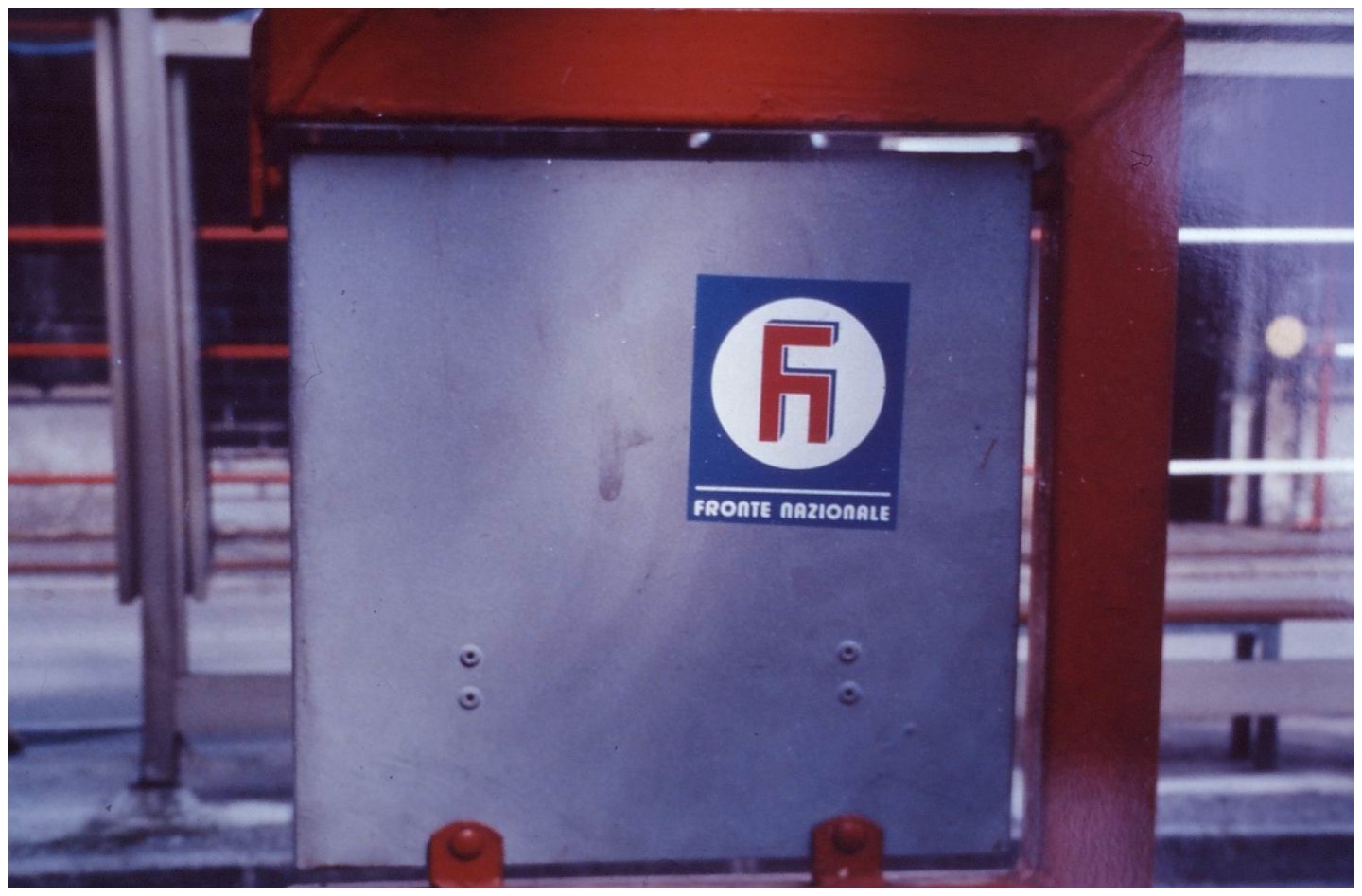
The poster of the Italian party "Nazionale Fronte"
Dr. Naomi Meiri-Dan
Lecturer in the Department of Visual and Material Culture